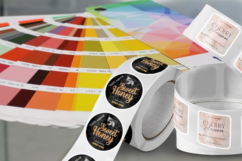
To create a great label, you must ask what looks good and what speaks to the audience. Color can influence feelings, decisions, and brand identity. In this article, we will further explore Color Theory Tips for Designing Powerful Labels and learn how you can make your product label attractive and effective. If you’re designing for the first time or updating your design, you can find actionable advice below to help you.
Utilize Color Psychology to Boost Your Label’s Impact
Colors are more than aesthetic. They send signals to the consumer. People already associate colours with emotions without even realizing it.
We often associate colour meanings with our everyday lives and experiences. For example, red symbolizes excitement, passion, and urgency. One might use the colour red for clearance sales or on products to make an impact at the end of the buying process and evoke energy. As for blue, its soothing, calm, and professional meaning often makes it a preferred color for banks and tech companies’ branding.
Color psychology may help you design labels that influence customers’ feelings and behaviours without saying a word. It’s essential to make your label appealing and effective for your target audience. To do this, choose colors that fit your brand’s values.
Match Text and Background Colors for Optimal Legibility
Even if the colors you choose are stunning, your design will not look attractive. If the text is not clear or readable, your design will lose its appeal. It is important to consider contrast when selecting text and background colors. It is crucial that the text is separated from the background sufficiently to allow the reader to read it easily.
For instance, a white-on-black text combination is classic, highly legible, and more. Similarly, dark blue text on a light yellow background makes a clear but pleasant textual presentation. The trick is to ensure that the font is different so that your customers can easily read the text.
Explore Online Tools That Help You Choose the Right Color Scheme
Choosing a colour scheme can be tricky. Especially if you are not a designer. Fortunately, many online tools can help you select just the right one. So, don’t stress over it. You can play around with colors, test complementary palettes, and check what works against accessibility rules with tools like Adobe Color Wheel, Coolors, and Paletton.
Moreover, tools offer suggestions based on color harmonies (complementary, analogous, triadic) to help create a visually balanced and engaging design. Whether you’re working with a color label printer or designing a label for a new product, using these tools will ensure that your colors aren’t just good-looking, but also work wonders for your brand.
Submit Your Artwork in CMYK for Professional Label Printing
When you finish your label design, make sure it is print-ready.
CMYK (Cyan, Magenta, Yellow, and Black) is the color model of choice in professional printing for a reason: it ensures that the colors you see on screen will be matched in print. The colors (Red, Green, Blue) look bright on your monitor, but the printer ink is based on the CMYK model.
Make sure to convert your artwork for color label printers to CMYK to avoid any surprises when you submit it for printing. This conversion ensures your labels will appear as you envision them, with the precise colours and tones you require.
Final Thoughts
When you think about what effective labels need, you probably think about the design colour and palette. Colours play an important role in your design, more than just as a neat element. Labels with the right colours can communicate, engage, and influence. Using Color Theory Tips to Design Effective Labels will make your product attractive. Moreover, your design should be simple yet eye-catching to create effective labels that stand out!
When a color label printer is essential to your business, whether for small print runs or large ones, create professional labels that accurately capture your brand and look great.
If you are looking for the best color label printers, TCS Digital Solutions has a range that will give life to your label designs.
Do you have any further questions regarding Color Theory Tips for Labels? Contact our support team via email at orders@tcsdigitalsolutions.com or call us at 1 (678) 824-2304 or +1 (762) 208-6985 to get clarification on all your questions. TCS digital solutions is here to assist you if you require assistance. We also have a blog section that answers all your questions regarding Color Label Printers.
FAQ: Color Theory Tips for Better Label Designs
What is Color Psychology, and Why is It Crucial for Label Design?
Color psychology studies the effects of different colors on our perception. Influencing consumer behavior is the core aim of label design for your product. Choosing the right colors that appeal to the audience can evoke feelings that match the product messages.
What Are the Best Color Combinations for Text and Backgrounds?
Some of the best combinations include.
- Dark text on a light background (for example, black text on white or cream).
- Light text on a dark background (Example – white text on navy blue or black).
- High contrast colors like yellow text on blue, or red on white, make the text pop and are easy to read.
Why is It Important to Send Label Artwork in CMYK Format?
It’s essential to send your artwork in CMYK so the colors you see on screen match the colors on the printed label. This corresponds to the color model used by printers, leading to a close match between the digital and physical products.
How do contrasting Colors Affect the Design of Your Labels?
Using contrasting colors in label design makes your message more effective. High contrast ensures that your text is legible and grabs attention, making it easier for consumers to read and process information quickly.
Related Articles

